A wrapper may be made to enclose the content of a page, and then you can write descendant CSS rules that mention that wrapper's ID or class name in the selector. But what if only IE thought that wrapper existed? Then those rules would only work for IE, while other browsers would ignore the rules completely.
This is more or less how it was with the Star-HTML hack, where a mysterious wrapper seemed to be surrounding the HTML element in IE browsers. This made possible a very clean and easy selector construction: * html #myelement {}. Now this trick is different because IE7 has lost the mystery wrapper and will not read that selector as IE6 does. What we need is a way to make a new wrapper to use that only IE can see. But how can this be done? It so happens that you can use Conditional Comments to make IE think there is a wrapper between the body and the entire page contents. IE's view of the page element hierarchy will become different from all non-IE browsers, letting us write CSS to take advantage of the difference. The code is not very difficult, but the syntax is a bit different and must be correct for the method to work.
Conditional Comments behave just like simple HTML comments, but they have a specific syntax that IE/Win browsers can recognize. When that syntax is exactly correct, IE/Win browsers will look inside the comment and parse whatever is inside.
The starting tag for the new wrapper will go directly after the body start tag, and the wrapper's end tag is placed directly preceding the body's end tag. Each of these div tags will be wrapped in a conditional comment, allowing only IE/Win browsers to parse those div tags. <!DOCTYPE your favorite doc type> <html> <head>...</head> <body> <!--[if IE]> <div id="IEroot"> <![endif]--> <p id="IE">This browser is IE.</p> <p id="notIE">This browser is not IE.</p> <!--[if IE]> </div> <![endif]--> </body> </html> The first block of code after the body tag has a starting div tag with an ID of #IEroot inside a conditional comment; remember, only IE sees this div.
The last block of code before the closing body tag is a closing div tag inside another conditional comment; this closing div tag will match the starting div tag in the first block of code. Again, only IE will see this closing tag.
Between the opening and closing of the #IEroot div is where all of the normal page markup will go. In this example it is just a box with some content, but the idea is for the #IEroot div to be the ancestor of all page content.
Using CSS, style the page as usual for non-IE browsers. Then in the same stylesheet, use #IEroot as a prefix in descendant selectors to target specific rules at IE. The example below styles the div called #anyelement to have a red border in non-IE browsers, and a blue border in IE. /* all browsers make border red */ #anyelement { border : 2px solid red; } /* all browsers see this, but only IE thinks #IEroot exists as an element and makes border blue */ #IEroot #anyelement { border-color : blue; } The first rule is a simple rule to apply a red border to #anyelement; this rule is seen by all browsers, even IE.
The second rule changes the color of #anyelement's border to blue, but the selector is a little different than the first rule. The second rule's selector is a descendant selector; it's interpreted as: the element with the ID of "anyelement" that is a descendant of the element with the ID of "IEroot" should have the following rules applied.
Since #IEroot was created using conditional comments and only IE can see the contents of conditional comments, then in IE, #anyelement is a descendant of #IEroot and the descendant selector matches. Therefore, this rule will apply to IE, making the border of #anyelement blue for all IE browsers, versions 5 through 7. And because #IEroot is the first div and wraps the entire page, it can be used throughout the stylesheet to target rules at IE. This is used just like the star-HTML hack was used, except that you cannot target the body tag with this method because the body element is not and cannot be a descendant of #IEroot.
Here is a live demo page. Be sure to view in both IE and non-IE browsers.
Using this technique you can target part of a stylesheet at IE with confidence that this method won't be affected by future browser releases.
The Anti-IEroot Rule
Normally the CSS code will be clean, and the #IEroot rules will simply override key rules in the main styles to make IE behave correctly. Some coders will want the option to write a rule that all non-IE browsers will read, but that IE will not. A Child combinator can be used in a certain way: body>#wrapper #anyelement { styles for non-IE only... } Just add a prefix to any selector for a page element (#anyelement) with body>#wrapper. Of course, you will need to have a #wrapper element in the page, or some other major element that is a direct child of the body. The clean HTML should have #wrapper directly inside the body element so that the selector above will work.
The Child combinator (>) selects the element on the right only if it is a direct child of the element on the left.
Hiding From IE
IE6 and below won't read the rule, for the simple reason that those browsers don't support the child selector itself. IE7 does support it, but IE7 also happens to think there is an element called #IEroot! For IE7, a selector like body>#IEroot>#wrapper would work, but the selector we described above does not include #IEroot. IE7 thinks #IEroot is in the HTML, so IE7 ignores the rule. Thus all IE/Win versions are blocked from seeing this type of selector.
More on Conditional Comments
Conditional comments allow special syntax constructions for checking the IE version and are proprietary to Internet Explorer for Windows. A conditional comment is an HTML element that, in IE may conditionally be read, but, to all other browsers looks like an HTML comment and is ignored. Here is an example of some markup with conditional comments: <!--[if IE]> <p>Only IE shows this paragraph.</p> <![endif]--> <p>A paragraph that all browsers display</p> In the above example, the first block of code has a paragraph of text inside a conditional comment. Internet Explorer has been designed to examine all HTML comments for certain syntaxes, and when it finds such syntax IE will simply read and parse whatever is inside the conditional comment. Because conditional comments are hidden inside syntactically correct HTML comments, all other browsers just see a comment and do not display the paragraph contained within it.
The next paragraph is outside the conditional comment and displays normally.
If you want to test your conditional comments in different versions of IE, one simple method is to have multiple versions of IE installed as standalones. But there is a problem with standalones: they don't support conditional comments correctly. This article will help you fix conditional comments and many other things in your standalone IE's.
If you haven't installed multiple IE's yet, go here to download a fast, easy, and complete multiple IE installer with all the tweaks done for you.
Deeper with Version Numbers
Conditional comments support targeting of specific browser versions, which means divs can be created that will be used in CSS selectors to target not just IE in general, but specific versions of IE. Here is an example of how this might be done: <!--[if gte IE 7]> <div id="ie7andup"> <![endif]--> <!--[if IE 6]> <div id="ie6only"> <![endif]--> <!--[if IE 5.5000]> <div id="ie5-5only"> <![endif]--> <!--[if lt IE 5.5000]> <div id="ie5-01only"> <![endif]--> <div id="anyelement">a box with some content</div> [... more page content ...] <!--[if IE]> </div> <![endif]--> Only one of the four conditional divs will be created in IE, depending on the version of the viewing browser, and none of them will be created in other browsers. Note that only one generic all-IE div end tag is required, so no need to have multiple CC's for this task.
The first div, #ie7andup, will be created in IE version 7 and up. The "gte" means "Greater Than or Equal to."
The second div, #ie6only, will be created in IE version 6 alone.
The third div, #ie5-5only, will be created in IE version 5.5.
The fourth div, #ie5-01only, will be created in IE version 5.01. The "lt" means "Less Than." IE4 is not included, since conditional comments were not introduced into IE until version 5.
When targeting IE5.5 you must add the zeros to the 5.5 or the browser may ignore the conditional comment. <!--[if lt IE 5.5]> is not good enough, it must be <!--[if lt IE 5.5000]>. There is no good reason for this, that's just how it works. gte IE 7 stands for "greater than or equal to IE7," while lt IE 5.5000 stands for "less than IE5.5." When writing these CC's, exact conformance to the syntax is required. Any error will cause the CC to become a normal HTML comment.
The corresponding CSS looks like this: /*** All browsers ***/ #anyelement { border : 2px solid black; } /*** For IE 7 and up ***/#ie7andup #anyelement { border-color : blue; } /*** For IE 6 ***/#ie6only #anyelement { border-color : green; } /*** For IE 5.5 ***/#ie5-5only #anyelement { border-color : purple; } /*** For IE 5.01 ***/#ie5-01only #anyelement { border-color : red; } See a live demo of the method. You will need multiple versions of IE to view all the variants.
Not only is IE styled differently, but different versions of IE are styled differently. For example, this method makes it easy to fix the box model problem in IE 5.x while not affecting IE 6 or 7. Each new #IEroot ID is customized to indicate what IE versions are targeted, in effect "labeling" each special IE rule by version number. This helps when later doing site maintenance, and team environments benefit as well from the reduced potiential for confusion.
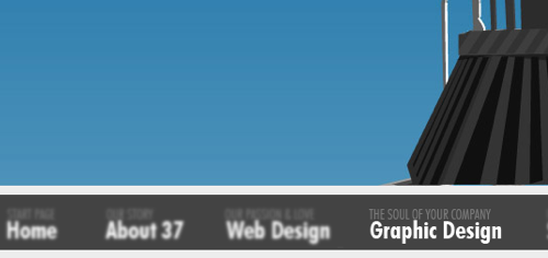
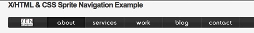
We’ve seen innovative ways in which designers and developers have used CSS to innovate upon its shortcomings. Here, you’ll find some of the best ways to use CSS for your website navigation. You’ll find a variety of techniques that truly showcase the capabilities of CSS.
In this article, you will find a collection of excellent navigation techniques that use the CSS to provide users with an impressive interface.
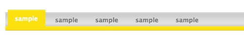
This another great CSS menu Stu Nicholls that’s unique – hovering over a menu item reveals a submenu. If you want get started with this menu just simple view the source code. Demo in page.
View Demo
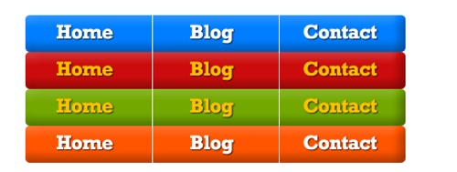
Matte is a simple CSS menu with rounded corners using two small images only from 13styles. It is maintained by David Appleyard who has lots of simple and advanced CSS-based menus.
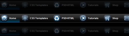
Inspired by the Hoverbox Image Gallery technique developed by Nathan Smith, CSS Hoverbox leans on the background-position CSS property to superimpose rollover images on top of neighboring menu items. Demo in page.
View Demo
This is a very basic CSS-based drop-down menu that’s excellent for trying to grok the technique involved in creating drop-down menu that doesn’t require client-side scripting.
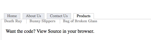
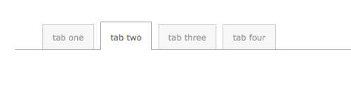
Here is another excellent method for creating a module tab interface based purely on CSS. Use the tabs in the page to learn about the instructions on how to implement this technique.
View Demo
This CSS menu on the popular web design agency SimpleBits shows a way for creating mini tabs. View the source code on the demo page to learn how it works (the code is inline and formatted well for readability for your convenience).
View Demo
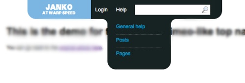
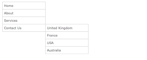
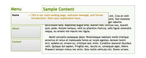
This A List Apart CSS menu technique is for a fly-out submenu that appears on the right of the top-level menu, leveraging the position: absolute CSS property to move the submenu to the appropriate level.
View Demo
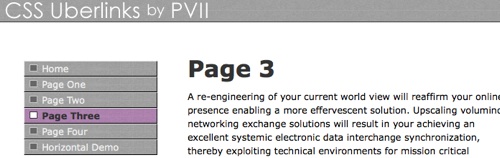
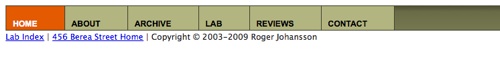
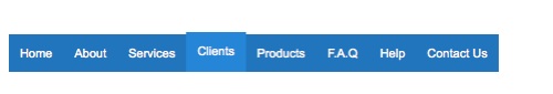
Roger Johansson of 456 Berea Street shows us the basic principles of turning an unordered list into a navigation bar – it’s a great starting point for beginners to learn about building a semantic HTML structure and then styling it with CSS.
We are always in search of great free resources, tips, tricks, etc. for our readers. Every day we work hard to find new resources and inspiration for designers like you. Today, we have another great post, “Discover the Best of the Web” on SmashingApps. In this, we made a list of 80+ Incredible Collection Of Inspirations, Tutorials And Resources For Designers. We obviously cannot cover all the best from the web, but we have tried to cover as much as possible.
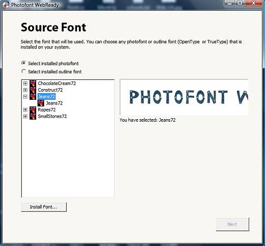
Photofont WebReady is a revolutionary technology for website typography. Fontlab’s Photofont WebReady can be called a font converter meant for Windows and Mac OS X systems, which can help you customize the fonts on a web page. Since the main technology lies in the conversion of texts into Flash objects, this technology can be best applied to comparatively shorter texts. Like headlines, just as has been done with the title heading above. Be it your blog or a web site, you can enhance the web pages with your own custom fonts of your choice.
WebReady is basically a software solution based on Flash and JavaScript. With this sIFR 2 compatible solution, you can customize the headings or main headlines of your website using any photofont, any TrueType or OpenType font by converting it into an embedded type web font. (See our headline? That’s not your usual Times or Georgia. Can you guess the font?) This embedded type web font is further rendered on the web page by using Flash technology. And the best part of it is that the standards compliance and search engine friendly feature of the page is still retained. With Photofont WebReady, you can simply change the typographic appearance of your blog or website and give it a new direction.
Main Benefits of Photofont WebReady
Following are some of the major benefits of using Photofont WebReady over the traditional fonts available. There’s a free video demo tutorial offered by the company to help you know its features in depth. Click here to view the Free Demo Video Tutorial.
Featured with a simple wizard interface that guides the user through simple step-by-step processes, which is easy to understand.
On your website or blog the use of new, interesting fonts can bring in dramatic change by increasing the attraction of the web page.
The use of custom fonts can also help you give a corporate branding to your website or blog on the web, which is very important.
If typographic effects are applied to create headlines and the results are saved as a PNG or GIF, these in many cases are not visible to search engines. You can’t copy/paste that text either. However, the web fonts created by WebReady are search-engine friendly and compliant with the standards. They are SEO visible like other HTML text. Try selecting/copying/pasting part of our headline above. You can’t do that with a bitmap!
The web font text created by WebReady is independent of browser used and is always visible to search engines and is search-able too.
Using photofonts you can display text with multiple colors and transparency. A translucent headline could overlay your logo or masthead. Or you could have a rainbow font. Or both! See photofont.com for some examples.
Visitors to your website using older browsers that do not support Flash or JavaScript are also capable of viewing the text, but in the web font that is mentioned in the CSS stylesheet and considered as default.
Photofont WebReady Solutions
Using the Photofont WebReady font converter, a TrueType font (.ttf), a photofont (.phf) or an OpenType font (.ttf, .otf) has the following possibilities;
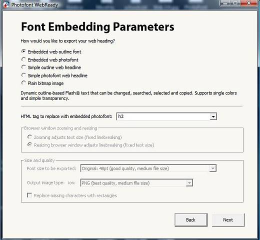
Convert into an embedded type web photofont, which is a Flash object that is bitmap based and can be consistently used in any website. The text is rendered dynamically in the typeface of your choice, while maintaining the compliant standards and searchability of the page.
Convert into a Simple photofont web headline, which is a Flash object that is bitmap based and static in nature. In this case, the text that has been specified during the conversion is displayed.
Converted into a plain bitmap image, where the text that has been specified during the conversion is displayed
Photofont WebReady Formats
The Import font formats of Photofont WebReady include;
OpenType PS (.otf)
OpenType TT/TrueType (.ttf) and
Photofont (.phf)
The Export font formats of Photofont WebReady include;
Embedded Web Outline Font (Adobe Flash .swf, CSS, JavaScript and optionally HTML)
Embedded Web Photofont (Adobe Flash .swf, CSS, JavaScript and optionally HTML)
Simple Outline Web Headline (Adobe Flash .swf)
Simple Photofont Web Headline (Adobe Flash .swf)
Plain Bitmap Image (PNG, JPEG, TIF, BMP) and
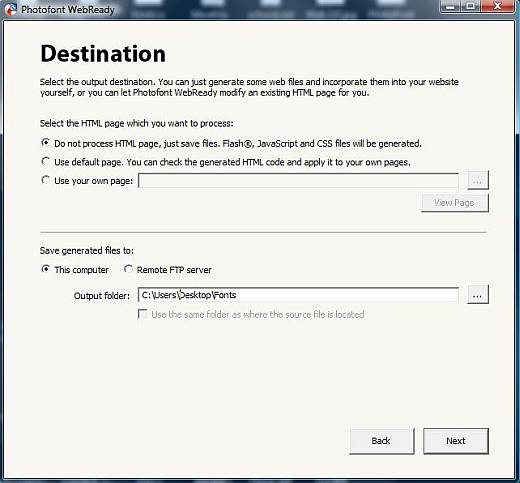
It is capable of modifying HTML documents too, but that is optional
However, please note that before going ahead with the conversion of any type of fonts into embedded web outline type, you must read the terms of the font End-User License Agreement (EULA) provided by the font vendor. This is only because EULA is actually responsible for governing font usage. To know more about it, please check out with Details About Font Licensing.
Software Requirements
For Windows version of Photofont WebReady, your system must have the following minimum software requirement;
Microsoft Windows XP, Vista or Win7
For Mac version of Photofont WebReady, your system must have the following minimum software requirements;
Mac OS X 10.4 or higher version recommended
PowerPC or Intel
To help the users with the entire process and details, a free copy of user manual is provided online for both Mac and Windows versions of Photofont WebReady. To get the user manual downloaded into your system, all you need to do is right click on the following link and choose any of the options between – “Download Linked File” and “Save Target As”. And you get a free copy of user manual in PDF format saved in your system. To get a copy, click Download Photofont WebReady User Manual for Mac and Windows Version.
If you want to create dynamic web headlines using the demo mode, the font selected by you will not be used. Rather, a default font will be used in this case, which can be considered as the only noticeable limitation of it. To get full functionality access, you have to buy the product and enter the serial number that will be provided to you.
Service And Support
Fontlab Ltd. provides free technical support to all its registered users. However, for exceptional cases like if the Serial Number or Installers are lost, a nominal service fee is charged.
At the first instance, it is advised to check the free user manual provided online in PDF format that can also be downloaded, before contacting the support team.
There are also online FAQs for instant help to the users. For any immediate technical inquiries, users can always check with the Frequently Asked Questions. Furthermore, if the answer to your problem is not listed in the FAQs, you can contact the support team by filling a simple Problem Report Form.
If you have any technical as well as non-technical queries prior to purchase,
you can directly join the Online Forum
of Fontlab or contact directly.
We are always in search of great free resources, tips, tricks, etc. for our readers. Every day we work hard to find new resources and inspiration for designers like you. Today, we have another great post, “Discover the Best of the Web” on SmashingApps. In this, we made a list of 85+ Excellent Resources And Tutorials Especially For Designers. We obviously cannot cover all the best from the web, but we have tried to cover as much as possible.
We are always in search of great free resources, tips, tricks, etc. for our readers. Every day we work hard to find new resources and inspiration for designers like you. Today, we have another great post, “Discover the Best of the Web” on SmashingApps. In this, we made a list of 70+ Promising Resources and Tutorials Especially For Designers. We obviously cannot cover all the best from the web, but we have tried to cover as much as possible.
The year 2009 is almost ended. We have explored and reviewed so many useful tools and resources for you all the year. Today, we are going to take a look on few of the web apps we have featured that we think you would like bookmark for 2010. I hope designers, developers and programmers will like this list, but you can also use them and will love them whether you are an office worker, a manager, a supervisor, a student, a home user, etc. They are really amazing in respect to their features. This is the list of 69 Coolest Web Apps Of 2009 at Work. Just take a look at them and share your thought’s here.
You are welcome to share more useful web apps that will be helpful for our readers/viewers may like. Do you want to be the first one to know the latest happenings at SmashingApps.com just subscribe to our rss feed and you can follow us on twitter and do not forget to become our fan on facebook as well. Adobe BrowserLab
An easier and faster solution for cross-browser testing. You can preview and test your web pages on leading browser and operating systems. This will help you get your results in real time, from virtually any computer connected to the internet. Notable
Are you stuck sharing feedback in text documents and email? Notable makes it possible to put your feedback directly on the webpage, highlighting your points exactly. With Notable you can quickly and easily give feedback on design, content, and code on any page of a website or application without leaving your browser. Google Calendar
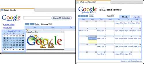
With Google’s free online calendar, it’s easy to keep track of life’s important events all in one place. With Google Calender, you can let your family and friends see your calendar, and view schedules that others have shared with you. You can get event reminders via email or have text messages sent right to your mobile phone. Wix
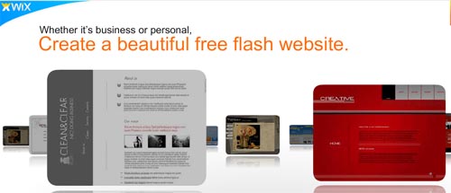
With Wix you can create a free website or make free MySpace layouts and Flash MySpace layouts. It’s the simpler, faster, better way to build & design on the web. Zapproved
Zapproved is a lightweight Web tool that makes group decision-making faster, easier and more accountable. It is a unique solution that introduces peer-to-peer and organizational techniques to improve the process of building consensus. PhotoSnack
With PhotoSnack it’s easier than ever to upload photos, create great photo slideshows, and share them with your friends and family. And by the way, it’s free. Office Live
You can use this service for free online storage and document sharing. You can store files up to 5GB, and share with anyone, and collaborate on a single document. It will allow you to view Microsoft Office Word, Excel and PowerPoint files from your Web browser. Concept Feedback
ConceptFeedback could be a great idea for marketers, designers and developers, provides a free and simple tool for getting third-party reviews on design concepts. Concepts may be posted publicly or privately and can include websites, logos, advertisements, videos, and more. DimDim
DimDim is a free web conferencing service where you can share your desktop, show slides, collaborate, chat, talk and broadcast via webcam with absolutely no download required for attendees. Photoshop.com
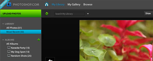
This is your online photo sharing, editing and hosting resource. You can upload, organize, edit, store (up to 2GB free) and share your photos. FreshBooks
FreshBooks is an online invoicing and time tracking service that saves you time and makes you look professional. This is so easy to use, it saves your time and gets you paid faster. You’ll actually love invoicing. You can keep track of your expenses, for both projects and yourself and easily re-bill clients on project expenses. Glasscubes
Glasscubes brings together a collection of online collaboration tools which facilitate better team working and improved communication. It will help you to replace email or existing methods of collaborating by using their online collaboration tools that simply enable users to improve how they work together. Glasscubes is perfect for small/medium size organizations, teams and people organizing projects. Remindo
With Remindo you can connect, share and collaborate with your team and clients. It will help you to create your company branded intranet in minutes and access it from anywhere on the web. Use it free for up to 3 GB of storage. HootSuite
HootSuite is the ultimate Twitter toolbox. With HootSuite, you can manage multiple Twitter profiles, pre-schedule tweets, and measure your success. HootSuite lets you manage your entire Twitter experience from one easy-to-use interface. Color Scheme Designer
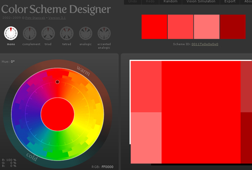
Color Scheme Designer is a brand new interface, as well as the engine, all rewritten from the scratch. Rapidly increased precision and color space conversions, better preview, enhanced scheme creation system, unique scheme IDs and permanent URL of the scheme. Mint
Mint is a modern, powerful, easy and secure web–based solution for online financial management. You can register anonymously using any valid email address, and then add the log–in information for the online bank, credit union, credit card and investment accounts you want to consolidate in Mint. PDF to Excel
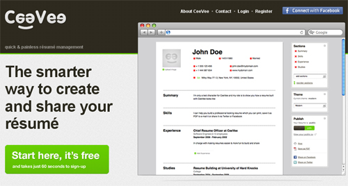
You can use PDF to Excel to quickly and easily create highly, editable XLS files, making it a cinch to re-use tables and spreadsheets from PDF files in Microsoft Excel, OpenOffice, Google Docs, and WordPerfect Office. Best of all, you can do it entirely free. CeeVee
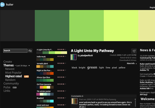
CeeVee is really easier and smarter way to create and share your résumé with anyone. It can simplify the process of posting your resume online. Kuler
The web-hosted application for generating color themes that can inspire any project. No matter what you’re creating, with Kuler you can experiment quickly with color variations and browse thousands of themes from the Kuler community. PHPanywhere
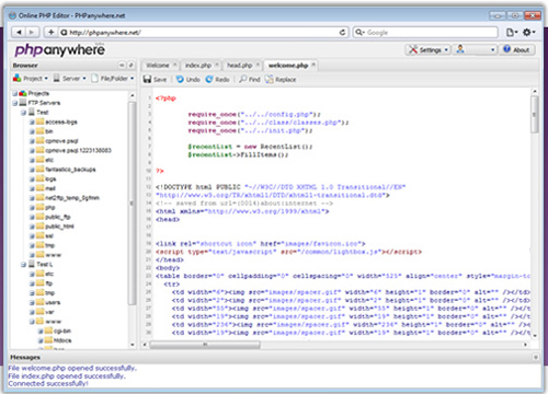
PHPanywhere is a new online service that’s changing the way people develop on the web. They enable users to develop and maintain their php/html projects online using any standard web browser. Zamzar
Zamzar is dedicated to helping you transform your songs, videos, images and documents into different formats. You can easily convert 1GB file. Its gives you 100GB inbox to store your files. WhatTheFont
For using WhatTheFont font recognition system, Just upload a scanned image of the font and instantly find the closest matches in their database. TimeBridge
TimeBridge is a web application that makes it incredibly easy to schedule and lead great meetings and follow up after you meet. This could be your best tool for calendar-wrangling, agenda-making, note-taking, team-motivating and a secret weapon in the battle against workplace inefficiency. Quicken Online
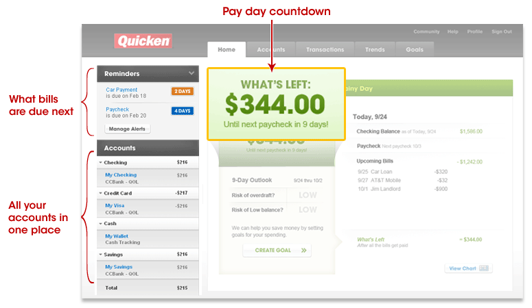
Quicken Online simplifies Internet banking by automatically organizing your financial accounts “ including checking, savings, investments, loans and credit cards “ in one place. You can use Quicken Online to easily and automatically track your spending so you know very easily where to save and when to spend and the best part is, it’s free. CodeRun Studio
CodeRun Studio is a cross-platform Integrated Development Environment (IDE), designed for the cloud. It enables you to easily develop, debug and deploy web applications using your browser. CoTweet
CoTweet is a platform that helps companies reach and engage customers using Twitter. You can manage up to six Twitter accounts through a single CoTweet login and assign tweets to your colleagues for follow up. Finally, a way to Get Things Done on Twitter. Creately
Creately is an Online Diagramming and Design is a joy to use. Its designed for ease of use and collaboration. It takes ‘easy’ to a whole new level by intelligently adapting to the kind of diagram you are drawing. Creately has been designed so you can draw just about anything, fast and easy. Bidsketch
Bidsketch is an application that lets you create, track, customize, and design beautiful proposals. Multiple ways to present your proposals ensure clients get what they want. You can export to PDF or share online. Every client gets a portal that lets them view and comment on their proposals. Facelift Image Replacement
Facelift Image Replacement (or FLIR, pronounced fleer) is an image replacement script that dynamically generates image representations of text on your web page in fonts that otherwise might not be visible to your visitors. Go2Convert
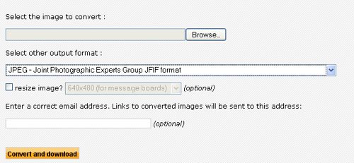
Go2Convert is a set of free web based tools that allow you to convert, resize a picture without having to install any software on your computer. It is not meant to be a complete Image editing software package. It is meant to be an easy to use solution to convert, resize your pictures and digital photos without the need to learn a complex software package. Once you convert, resize an image, you can choose to copy image’s URL or download it directly to your computer – It doesn’t get easier than that. Taweet
Taweet is a social calendar and event promotion application for Twitter. Taweet adds a whole new dimension to your Twitter experience. Colorjive
If you’re wondering whether it’s a good idea to paint your kitchen red, you can test it with Colorjive. It just takes a few clicks. You don’t even have to pick up a brush. You can paint virtually with Colorjive. They have got thousands of colors for you to choose from. They have a basic account that is absolutely free. With a free account, you can upload a single photo, paint three objects in that photo and save three different versions. Verb
Verb is a user focused task management and sharing application. If you have things that need to be done, then this is for you. Verb was built with individuals and small teams in mind. It is the perfect solution for freelance designers and coders who want to manage themselves and their collaborations. 247webmonitoring
Having a good uptime is essential for the success of your website. 247webmonitoring will monitor it 24X7 from their servers and notify you whenever it goes down. This will check your website every 15 minutes to know it is up. They will send you notification by email or SMS when it goes down. So you can quickly fix the issue and you can stay happy. This way you can relax and focus on your core business. In future, you will also find out how fast your site is from different location. Tracer
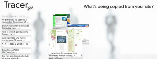
Tracer is a brand new way to generate more visits and page views. You can get credit when content is copied from your site. It will help you to measure and understand user engagement and Improve your search engine ranking. Wordoff
Wordoff is simple and useful web tool that lets you remove unnecessary tags and styles from HTML code. Most of us have to cleanup the HTML code manually in our working life. This web tool defintely help all of us in that situation and you also find this worth bookmarking. Timetonote
Timetonote is a web based collaboration tool that helps you and your team keep track of all interactions with customers, leads, or anyone important to your business. It helps you keep track of your contacts information and of what needs to be done next about them. With Timetonote, you know who you’ve talked to, what you talked about, and what you need to do next. MyFontbook
MyFontbook is an unique online font viewer that helps save designers time by providing a number of tools to view installed fonts quickly and easily. Unlike a classic font management tool, MyFontbook is platform independent and can be used freely through any web browser. Remember The Milk
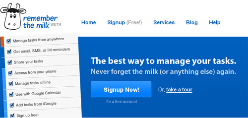
An intuitive interface makes managing tasks fun. You can set due dates easily with next Friday or in 2 weeks. It has an extensive keyboard shortcuts make task management quicker than ever. Remember The Milk allows you to receive reminders via email, SMS, and instant messenger (AIM, Gadu-Gadu, Google Talk, ICQ, Jabber, MSN, Skype and Yahoo! are all supported). ShowDocument
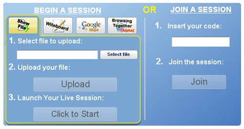
ShowDocument is a free service for online meetings with fully synchronized co-browsing of any document. It is a quick and simple way to share a document with other people at the same time. It is a web collaboration platform that lets individuals have a free online meeting. It is an alternative to various commercial desktop sharing applications. One can easily upload any file and during the session mark it up with a pen or a highlighter tool in addition to a text box tool and eraser. Preezo
Preezo is an Ajax web application that gives you the power to create and share professional quality presentations over the web without software or plugins. ViewLike.Us This is a brand new site that allows you to check out how your website looks in the most popular resolution formats. It’s all powered by Ajax & PHP so no need to download anything. Using ViewLike.Us is perfectly free. MyFax
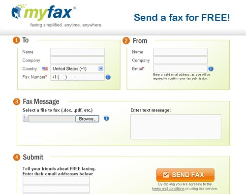
MyFax Free lets you send a fax at no charge through the Web to 41 countries including the US, Canada, most of Europe, China, Japan, and South Korea. MyFax supports 178 files types including files created by most popular word processors and graphics programs. Shareflow
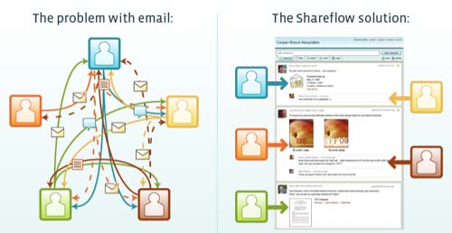
With Shareflow you can share your team conversations so everyone involved can clearly see what’s being said, and you can all get more done. The more you use email, the more work you create for your team. Important information gets lost in the shuffle. The Shareflow bookmarklet gives you one-click access to post content from the web to any of your flows. You can use the bookmarklet with Yahoo! Mail, Windows Live Mail, and Gmail to share your email on a flow. Create multiple flows to organize different projects or teams. You can add or remove someone at any time and invited members can create their own flows, so different teams can work amongst themselves. Mockingbird
Mockingbird is an online tool that makes it easy for you to create, link together, preview, and share mockups of your website or application. Present.ly
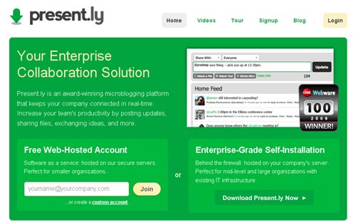
Present.ly is an award-winning microblogging platform that keeps your company connected in real-time. Increase your team’s productivity by posting updates, sharing files, exchanging ideas, and more. Moogo
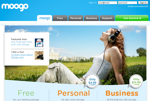
Creating your own website with Moogo is incredibly easy. Moogo offers you a simple way of creating your own easy-to-update website with style even if you have never created a website in your life before. Moogo is perfect for individuals, small businesses, clubs and organizations, sport teams, real estate…or making a website for your band or your pet. Typetester
The Typetester is an online application for comparison of the fonts for the screen. Its primary role is to make web designer’s life easier. As the new fonts are bundled into operating systems. Pict
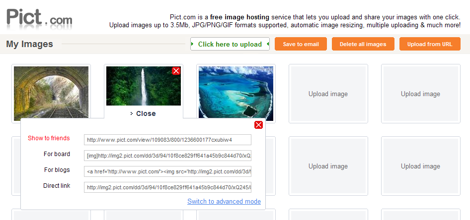
Pict is a free image hosting service that lets you upload and share your images with one click.
You can upload images up to 3.5Mb, JPG/PNG/GIF formats supported, it has automatic image resizing, multiple uploading & much more. Clicktotweet
Clicktotweet is the best, easiest and simplest way to promote your stuff on Twitter. Now, whoever clicks on the link will have the message automatically added to their Twitter status box, then they simply click to tweet. Task.fm
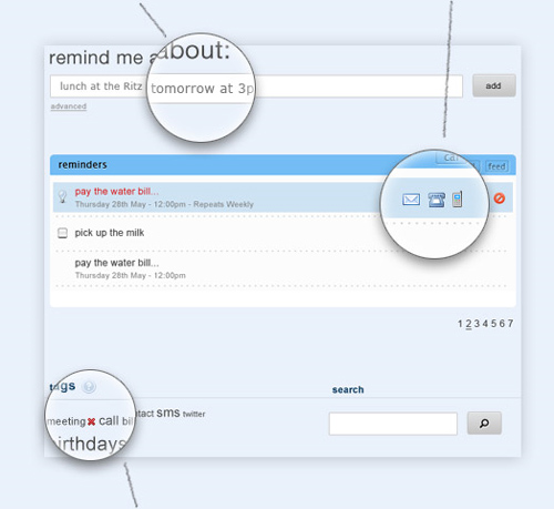
Task.fm is a realy simple reminder and task management tool. Just use task.fm to create reminders that can be dilivered via sms, email or voice call. Task.fm is smart enough to understand your natural lnguage so you don’t need to bother entering daters manually. Instead, just type something like “meeting with bob next Tuesday at noon” and they will pick out the date, time and event automatically. You can create reminders on the task.fm site, through email or Twitter. Task.fm is free and allows you to create an unlimited number of reminders. Font Burner
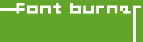
Font Burner is the easiest way to add great fonts to your website. Just pick one of over 1000 quality fonts, add a chunk of code to your site, then sit back and admire your beautiful typography. Live Mesh
With Live Mesh, you can synchronize, share and access files with all of your devices, so you always have the updated copy of your files. It’s very simple and easy that you can now access your files from any device or from the web, easily share them with others, and get notified whenever someone changes a file. The best of all this service is powered by Microsoft and absolutely free for everyone. Ta-da List
Ta-da List is a simple tool that lets you create to-do lists. It’s really useful and absolutely free. Ta-da List is the web’s easiest to-do list tool. You can make lists for yourself or share them with others. It couldn’t be simpler but Ta-da List is the web’s simplest and fastest to-do list maker. Friendpaste
A fast service where you can copy/paste your code, recipe, anything else and give the link to your friend. You can select your preferred languages and possibility to edit pastes. This service support for a large number of syntaxes that you would need. Tweepler
Tweepler Is an easy, more enjoyable way of processing your New Twitter Followers. View a list of New Followers and classify them in one of two “Buckets” Follow meaning you wish to follow them back and Ignore meaning you don’t wish to follow them and want to archive them out of the way, reducing clutter. Cozi
Cozi is a free web service that helps families manage crazy schedules, track shopping and to-do lists, organize household chores, stay in communication and share memories”all in one place. Server Check
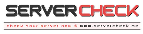
Server Check is the online server checking resource. You can check if a website is working or if a server is offline, lookup a server’s IP address, search for other domain names and websites hosted on a server. twitterfeed
Twitterfeed is a free service that will automatically tweet any post directly via your rss feed on twitter that you publish on your blog. Box.net Box.net’s online file storage makes it easy to securely share content as a link or a shared folder with anyone inside or outside your company. This will help you create an online workspace where you can share project files, add comments, assign tasks, start discussions or create new content. EmailTheWeb
EmailTheWeb is the only web-based service that allows you to email any web page to any one. The entire web page is emailed in a flash and is captured as it is now. Your recipient will see the same exact page as you. Cometdocs
Cometdocs is a one of its kinds free online document conversion interface that offers a large set of document conversions that can’t be found anywhere else online. Its unique features include on the fly OCR conversion capabilities, over 50 different conversion options and proprietary XPS and PDF conversion abilities that retains formatting, images and text in the selected output format. And best of all its available free of charge for everyone. Ronin
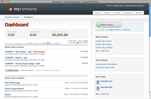
Ronin is a flexible application designed for creative professionals looking for an easy, affordable, web-based way of managing clients and invoices. You can send invoices and estimates in multiple currencies. The dashboard provides an at-a-glance summary of account activity for all of your staff users. Quickly access existing invoices and create new clients. Manage your account with simplicity. Browsershots
Browsershots makes screenshots of your web design in different browsers. It is a free open-source online service. A number of distributed computers will open your website in their browser. Then they will make screenshots and upload them to the central server. Tweetafile
The only thing that people can do through email that they can’t do with Twitter is send files. Now with TweetaFile, you can. Pictures, videos, documents… whatever you want to share with your followers or individuals, you can do it with Tweetafile. imgur
imgur is the simple image sharer. It’s the best way to host your image, and is always completely free. Sharing your images has never been easier. formatpixel
Create your own online magazines, fanzines, brochures, catalogs, portfolios and more. Using the formatpixel online editor you too can design page based projects, layout text, upload your own images, add interactivity and customise their appearance. DocJax
DocJax is a search engine for documents, which allow you to search documents and e-book from everywhere, preview them and even download them for free. Checkvist
With Checkvist you can easily work with multiple outlines or hierarchical to-do lists. Extensive use of keyboard navigation and shortcuts allows you to create an outline exactly with your typing speed.
We are always in search of great free resources, tips, tricks, etc. for our readers. Every day we work hard to find new resources and inspiration for designers like you. Today, we have another great post, “Discover the Best of the Web” on SmashingApps. In this, we made a list of 60+ Ultimate Resources Especially For Designers. We obviously cannot cover all the best from the web, but we have tried to cover as much as possible.
This is one of the very best list of its kind where you can find the simplest online web designer’s tools that are developed for designers and may be very helpful for you as well when you want to get your work done or just for fun. I hope web designers will like this list, but you can also use them and will love them whether you are an office worker, a manager, a supervisor, a student, a home user, etc. Most of them are not very well-known, but they are really amazing in respect to their features. This is the list of 23 Brilliant Web Apps To Simplify Designer’s Work Life. Just take a look at them and share your thought’s here.
You are welcome to share more Useful web tools that will be helpful for web designers and our readers/viewers may like. Do you want to be the first one to know the latest happenings at SmashingApps.com just subscribe to our rss feed and you can follow us on twitter as well. Adobe BrowserLab
An easier and faster solution for cross-browser testing. You can preview and test your web pages on leading browser and operating systems. This will help you get your results in real time, from virtually any computer connected to the internet. Color Scheme Designer
Color Scheme Designer generates color schemes of several types. Every scheme is based on one (base) color, which is supplemented with additional colors making together the best optical imperession. PHPanywhere
PHPanywhere is a new online service that’s changing the way people develop on the web. They enable users to develop and maintain their php/html projects online using any standard web browser. Carbonmade
With Carbonmade, you can manage your online portfolio with a variety of tools that allow you to change how you display your work. The core idea behind the design of Carbonmade is to keep your images or video at the forefront. Posterous
Posterous lets you post things online fast using email. If you can use email, you can have your own website to share thoughts and media with friends, family and the world. You can attach any type of file and they’ll post it along with the text of your email. iPlotz
With iPlotz you can create clickable, navigable wireframes to create the experience of a real website or software application. You can also invite others to comment on the designs, and once ready, you can then manage the tasks for developers and designers to build the project. Photoshop.com
This is your online photo sharing, editing and hosting resource. You can upload, organize, edit, store (up to 2GB free) and share your photos. Typetester
The Typetester is an online application for comparison of the fonts for the screen. Its primary role is to make web designer’s life easier. As the new fonts are bundled into operating systems. Pict
Pict is a free image hosting service that lets you upload and share your images with one click.
You can upload images up to 3.5Mb, JPG/PNG/GIF formats supported, it has automatic image resizing, multiple uploading & much more. Font Burner
Font Burner is the easiest way to add great fonts to your website. Just pick one of over 1000 quality fonts, add a chunk of code to your site, then sit back and admire your beautiful typography. Iconza
A collection of free icons that can be colored and reduced in size to your taste. If you are a happy site or blog owner, you will be able to pick icons that will fit right into your design. Verb
Verb is a user focused task management and sharing application. If you have things that need to be done, then this is for you. Verb was built with individuals and small teams in mind. It is the perfect solution for freelance designers and coders who want to manage themselves and their collaborations. CurdBee
CurdBee is a safe and secure web-based billing application. You can use it to send clients invoices and then collect payments via PayPal or Google Checkout, billing them easily in the currency you choose. It’s so simple, you won’t believe it till you see it. EmailTheWeb
EmailTheWeb is the only web-based service that allows you to email any web page to any one. The entire web page is emailed in a flash and is captured as it is now. Your recipient will see the same exact page as you. MyFontbook
MyFontbook is an unique online font viewer that helps save designers time by providing a number of tools to view installed fonts quickly and easily. Unlike a classic font management tool, MyFontbook is platform independent and can be used freely through any web browser. 247webmonitoring
Having a good uptime is essential for the success of your website. 247webmonitoring will monitor it 24X7 from their servers and notify you whenever it goes down. This will check your website every 15 minutes to know it is up. They will send you notification by email or SMS when it goes down. So you can quickly fix the issue and you can stay happy. This way you can relax and focus on your core business. In future, you will also find out how fast your site is from different location. ViewLike.Us This is a brand new site that allows you to check out how your website looks in the most popular resolution formats. It’s all powered by Ajax & PHP so no need to download anything. Using ViewLike.Us is perfectly free. Tracer
Tracer is a brand new way to generate more visits and page views. You can get credit when content is copied from your site. It will help you to measure and understand user engagement and Improve your search engine ranking. Picnik
Picnik makes your photos fabulous with easy to use yet powerful editing tools. Tweak to your heart’s content, then get creative with oodles of effects, fonts, shapes, and frames. It’s fast, easy, and fun. Go2Convert
Go2Convert is a set of free web based tools that allow you to convert, resize a picture without having to install any software on your computer. It is not meant to be a complete Image editing software package. It is meant to be an easy to use solution to convert, resize your pictures and digital photos without the need to learn a complex software package. Once you convert, resize an image, you can choose to copy image’s URL or download it directly to your computer – It doesn’t get easier than that. ShowDocument
ShowDocument is a free service for online meetings with fully synchronized co-browsing of any document. It is a quick and simple way to share a document with other people at the same time. It is a web collaboration platform that lets individuals have a free online meeting. It is an alternative to various commercial desktop sharing applications. One can easily upload any file and during the session mark it up with a pen or a highlighter tool in addition to a text box tool and eraser. PXtoEM
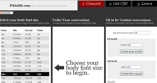
This is an online calculator that can help you easily covert pixels, to EM, to percent or to points. fivesecondtest
A simple online usability test that helps you identify the most prominent elements of your user interfaces.


